Thursday 26 February 2009

Glorious

Today Tom from Glorious, (a graphic design company, based in Manchester, who have won numerous awards and were in the top 5 best design companies in the North of England.) came into college to speak to us about his work, experiences and share tips and advice. He brought loads of work to show us and talk about and it was really interesting. They do mostly typographic based work, and Tom showed us a lot of identities they had designed and also showed some work he had done but the client never took it, which was different. Some of the work that really stuck out was the twist and turn identity, it's not massive changes but it's really affective. And the pay and display ticket advertising a exhibition that was taking place in a car park, is just brilliant such a simple solution but so interesting and eye catching. 


But the design i liked the absolute best is this barber shop project, firstly the simple fact of red and white stripped paper and a cut out in the sleeve (creating the spinning barbers pole effect) is just great. And the calender picture are just so simple and clean and the use of white space is great. To check them out go to www.gloriouscreative.co.uk


Tuesday 24 February 2009

Audi adverts

The recent Audi adverts keep catching my eye, i think they are really interesting for car adverts, they have avoided the usual boring ad watching the car drive down a road. And good for them they have made unusual adverts that get your attention and also keep you hanging on to see what it is! These two adverts i think are the best Audi ones i've seen and so different to the other car ads ...


Monday 23 February 2009

David Carson

From the start of my graphic design life i have always been interested in David Carson's work. His innovating magazine designs and experimental type has been the topic of a lot of debates and arguments within the design world. However his blatant ignorance of the graphic design ' do's and don't's ' is what he is so well known for. Here is a couple of pieces of his work that i like but to find out more about him and his work go to http://www.davidcarsondesign.com/?dcdc=top/t


Friday 20 February 2009

Pearlfisher

Vicky from uni told me to look at this site as they have some Jamie Oliver stuff on here, and she thought it might be what i was looking for. Looking at their site is really interesting they have so much work for big clients such as Absolute Vodka,  Green and Black's and Innocent. They work is amazing really cutting edge, fresh feeling designs, some are just so simple they are great, their packaging is really eye catching and fun. If i could i would put all their work on here, however i can't so here is some examples of Jamie Oliver's stuff and also a logo for nude, which i think is so clever and interesting. If you want to check their work out go to .. http://www.pearlfisher.com/


Wednesday 18 February 2009

Day seven

Day seven is a London based design acency, with 19 years experience. I came across them whilst browsing the net, their front page of their site is really eye catching as well as the name, so i thought i'd check it out. They have some really good work, it's really intersting, i've put some up but to check them out go to .. http://www.dayseven.co.uk/


Honda Cogs

This advert is sooooo cool i think its just so different from all the other car adverts and it interests you. It's a domino effect of all the car parts, i don't know if they actually did this for real but if they did it would be so cool. I think it's really quirky and fun! Check it out at http://www.youtube.com/watch?v=FGngcQb_0qg     as soon as i can download the video i'll post it up.

Paisley Peach

I found this site while browsing, first impressions is their site is really nice and ... Pretty!  They have a little intro on their 'about us' page which i think fits really well, ' brings your visionary palette to life with colour, texture, beauty and infinite imagaination.' I couldn't see their work very well as they have all copyright protection on it but here is come examples i found, i don't really think it's amazing i think it's a bit dull but i think they have some nice little patterns so if you want to see more check them out at .... http://www.paisleypeach.com/


Tuesday 17 February 2009

Truth VS. Fudge

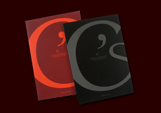
Truth is a graphic design agency made up from a partnership (Darren and Jane) who previously worked together for a different design agency. They both came into college to speak to us about their work and experiences within the industry and to tell us some helpful tips for when we try and break into the industry. Darren does most of the design work and concepts and Jane does all the organizing and difficult boring bits! Therefore Darren was the one mostly talking about the work. They showed some really interesting work and Darren showed a lot of type faces that he had made and explained how he got to the finished type face, which was interesting. They told us that its important to not have a particular style, its good to experiment and learn all the crafts and understand their place. He also told us that we should always rationalise -  explain why we have what we have done, to create something with a purpose. I thought these were really good points of advise. They showed us work for big clients such as Versus cancer 08, Reebok and Coca- Cola, and explained their reasoning behind the design concepts and really made me believe in the idea behind the design.

Gavin from a design agency called Fudge came into college to talk us through the process of designing the England squash identity. He showed us all the rough sketches they did where they found their ideas right through to the final thing. Gavin told us they have 6 stages to designing: Project scope, Research, naming, design concept, design development, design application. They spend two days researching and analysing England squash. He said how important it is to fully research the history of the company and the previous identity's for that company, it's important to fully understand the company and how it works and what it does. He also said it's important to research other logos within that field i.e if you were re-branding Nike, research all the other sports company logos e.g Reebok etc. He put into perspective the amount of time you have to complete the briefs from clients. He also said that it is key to have a full understanding of the client and to look at other brand within that area. Gavin had to present his idea three times to the client before he accepted it, and also had to bring the client back down to earth. The client didn't like the rose Gavin had incorporated into the design, but as Gavin says the rose isn't for you its for your customers. I found Gavin's presentation really useful. It showed how hard it can be some times to make someone else see what you see and like your idea as much you do.

Over all i enjoyed both presentations and learnt a lot from the designers that came in. Having the designers come into college and tell us about their work and getting to meet them, makes me realise how down to earth they actually are. When i think of graphic designers for some reason i associate them with a kind of celeb status, so them being in front of us, messing up their presentations and telling us the hard times they had getting into a graphic design agencies reassures me that they are just human-beings no different to me. I think that Darren from truth had a lot of work to show us which was really interesting and he presented really well and kept us all interested. Truth is a fairly new company so it was good to see how quick they got on their feet and the names they had already worked for. However Gavin who didn't present as well, Presented something that we had never seen before (this being the process). I felt i learnt a lot off Darren and Gavin but Gavin put the time he had into perspective and let us know how difficult it is to please other people and agree on what is the most effective. Also Gavin's presentation was different it's the only one of that kind that I've seen all the others have been like Darren's which is still interesting and will still find out some good tips. Gavin just took us through the process of getting to the final stage, which is no too dissimilar to what we do now at college, it was so re assuring knowing that how we work at the moment is not too different to the way everyone works out there in the industry. I think that both presentations were good in their own way Gavin's was different but i feel that i got just as much out of Darren's as i did out of Gavin's. They both showed high standards of work and both told us a lot of useful tips.

Sunday 15 February 2009

The Chase

At the moment the brief we are working on in college it an identity brief, given to us by The Chase. They are a Graphic design agency set up in Manchester but now have a office in London and a satellite office in Preston. They have 46 staff and a turnover of 5.6 million. And they produce some great work. They have done work for some big names such as The Co-operative Group, BBC, and Selfridges. I've picked out a few pieces of what i think is excellent work, simple but effective solutions, but to check out more go to http://www.thechase.co.uk


Turner Duckworth

I came across Tuner Duckworth whilst doing some research for a brief at college. Their work is a great, they have two offices one in London and the other in San Francisco and work flows freely between the two. The work produced is really clean and fresh and also playful, here are some examples but check it out for yourself at http://www.turnerduckworth.com/


Thursday 12 February 2009

Fudge

Fudge is a design acency based in Bolton. They came into college to speak about some of their work and the process from getting a brief from a client to producing the final piece of work. It was really quite interesting. I've put some of their work up here but i think they do really good design work and they come up with great solutions so check them out at http://www.fudgestudios.com/


absolute

I have come across this graphic design agency in Nottingham called absolute. It was founded in 1993 by Dave Ellis and Paul Crosson, i had a look through their portfolio, it was rather big as you can image they have had 16years to build it up! I've picked out some pieces i really liked but to check out more go to http://www.absolute-design.co.uk/home/


Fox Graphics

Fox Graphics is a high quality creative design consultancy with ethics. I think they have a nice identity, so i had a look at their website, yet again their wasn't much info about the company and the people behind it but there was a portfolio with some nice work. Check them out at http://www.foxgraphicsdesign.co.uk/index.htm


Fire creative

Fire creative are a graphic design company based in Manchester, they design concepts for companies. I found them on the web and had a look at their portfolio. Their site doesn't really give you much info about the company itself and who they are, but they have some interesting work. If you want to check them out go to their site at http://www.firecreative-uk.com/


Monday 9 February 2009

MDA:creative

This is a design company i came across while on the net, i noticed that they are in Stockport and thought i'd have a look. I was really impressed with their website it's really fun and not just a boring, normal site.  Mda was born in 1977 and is now one of the largest marketing communications groups in the North of England. It has over 50 people working there! I had a look through their portfolio and there work is really fresh and clever, i like the way they work, it's uncomplicated! Here's some of their work, but to see more check out their website at http://www.mdacreative.com/


The Plant

I was looking on the net for the graphic design company who did the Jamie at home tv shows, Hello Charlie. However i discovered they don't have their own site they worked for Jamie so i was gutted, but i came across this cool design company (The Plant) which made my day! The Plant began in 2004, Matt Utber is the founder, as well as their name being cool so it there work, and the way they work. They don't have a particular style except for producing very modern, interesting, chic work, they just do the job, and do it well. And even better they did the cover for Jamie's book! Winner! They have worked with some big names like MTV and jamie Oliver, and i haven't seen one piece of work i don't like! Check them out at http://www.theplant.co.uk


Milk it

I came across this graphic design company while on the web! The name (Milk it) caught my attention so i thought i had to have a look. They are a creative branding and graphic design company based in London, their work seems to have a wide spread style to fit the clients wants and needs. But looking at the name i was expecting some crazy, bright, bold designs and i found more civilized, mature designs, however i still think they are good!


Making contact with Vault49

I have just send a e-mail to Vault49 asking some questions about them and the design industry, this is questions i sent, now im just waiting on a reply!

I can see in your portfolio you have done some work for big names like Bacardi. and Honda. Did you contact them or did they come to you?

What inspired you to become a graphic designer?

I know you founded Vault49 in 2002 but how long did it take you to build up clientele and make a name for youselves?

Which designer/s influence you in your work?


Vault49 have suprisingly got back to me on the same day!! however they said they do not have enough time to answer my questions so sent attachments of inverviews.


Friday 6 February 2009

Pictograms

We have been given a short brief at college, it is to
 get us used to using illustrator. The brief is to create two pictograms, one of myself and one o
f a class mate, pictograms are simplified pictures of people or things ie. the walk man on traffic lights, they are different from symbols which are usually abstract images ie. the nike swoosh. 

This is my pictogram of myself ....


And this is James ....


UPDATE!!!!!! My tutor said that he couldn't recognise that the top pictogram was me so i've made this new one! which i think is worse!!!


Thursday 5 February 2009

Vault49

Vault49 is a design, photography and illustration boutique based outside New York. I came across these in college and loved their work, it's really interesting and different. The longer you look at their work the more you see, it's very detailed and vibrant, i really like this kind of work, if you do to check out their website at http://www.vault49.com/


Wednesday 4 February 2009

My Graphic Garden

My Graphic Garden is a boutique design bussiness that i came across while i was surfing the net. It consist of a team of graphic designers/illustrators, and they do a lot of web/logo design and illustration. When you first enter the site your hit by a big back and white floral inspired print which kind of sets the scene for the rest of thier work.I took a look at thier portfolio and its quite nice, it gives a very pretty, femine feel and uses alot of the floral type prints,but i like it. Here some of thier logo work, if your interested visit their site at
http://mygraphicgarden.com.au/company-boutique-web-design/aboutus-boutiquedesigns.php